"Branding is the visual, emotional and cultural image that surrounds your company and your product." - Chuck Pettis, EvansGroup
"(Branding at shows) can't merely be a reformulation of what's on television. The two media really have quite different objectives." - Joe Gallant, Nissan
what's the design objective?
The objective of an exhibit display is to create a visual 'speed bump' to make attendees stop and look. As a designer, there are several things to consider, and it's not just the colors and layout; the first step to THINKING about your design is to do the most obvious -- research.
[advice #1: NEVER start designing unless you do your research first!]
- "Why is my client exhibiting?"
- "What is the purpose for them to go to the trade show?"
- generate sales?
- create awareness of the brand?
- teach something?
- introduce a new product or service?
- "Who are they hoping to attract?

Can you guess what the objective of this Blue Man Group exhibit is? It's an awareness campaign to let fans know where they are performing. Can you guess who the target audience is?
4 mandatory elements for your design
- Visual (photograph or illustration)
- Headline (usually the company's tagline)
- Company Logo (use the logo, instead of just typing the name, as this helps create brand recognition)
- Web site
the power of color
Okay, so now you know that you've got to create a visual 'speed bump.' One of the fastest ways to achieve this is through an anomaly [a·nom·a·ly [uh-nom-uh-lee]
 ə
ə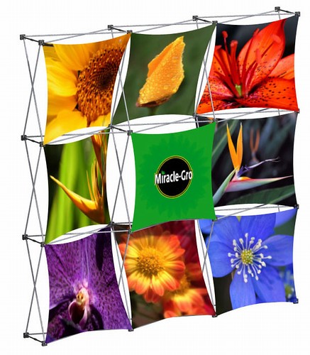 1. a deviation from the common rule, type, arrangement or form.
2. an odd, peculiar, or strange condition, situation, quality, etc.
3. an incongruity or inconsistency.
Anomalies in design basically means contrast. Creating a contrast through color, shape, size and/or texture. The objective in a trade show is to stand out from the visual noise of other exhibits. Creating contrast is a challenge but necessary to aid in achieving your exhibiting objectives.
Unfortunately, as a designer, you may be limited to the colors and standards of your client's brand. That's okay. Don't let this discourage your creativeness. Only if it's critical to the design objective may you select an 'accent' color to be in the mix of your brand colors. e.g. promoting a new product line (sample the label color of the product as part of your design accent color.)
Here are some color psychology tips to consider:
- BLACK portrays power and sophistication, but also stubbornness
- GRAY encourages creativity and a contemporary feel especially when contrasted with a cool color (blues, greens, purples)
- BROWN/BEIGE is interpreted as informal (usually the blue collar industry)
- WHITE implies purity and honesty, as well as traditional
- RED attracts the eye and promotes high energy and increased blood flow, which means it can induce an anxious feeling in passer byers
- ORANGE attracts the eye but be careful, a super bright shade of orange can imply cheap or fast (think Whataburger)
- BLUE is calming and encourages fantasy. With large amounts of blue, it can create drowsiness and boredom. It's interpreted as traditional and sophisticated.
- SILVER and other metallic colors can indicate top-dollar products/services
- YELLOW brights and catches attention, but too much makes it hard to focus on a message and may be irritating
- GREEN is obviously associated with nature and calming, people think money or freshness
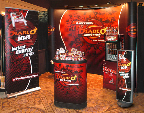
 What do you think of this exhibit? I'd walk right by, would you? It's probably best that I leave my comments to myself on this one!
[advice #2: Think BILLBOARD not BULLETIN BOARD]
the message - say it in one sentence
I have this saying, "If you can't say it in one sentence, you have no idea what you're trying to say." Repeat this to yourself as you think of your exhibit's overall message.
 The message USUALLY reflects the main objective of your client's reason for exhibiting. For example, if Motorola comes out with a new device they w ant to debut at a trade show, you may want to show the tagline of that particular product's marketing campaign.
Don't forget to reflect the mood and personality of that target audience. A teenager laughing and talking on the phone, or a teen ager smiling and texting. It all depends on the overall message and objective.
[advice #3: Most of the time, designers aren't asked to do the research. BUT, it's YOUR responsibility to find out the answers to these exhibiting objectives. Clients, often times, have no clue that you need to consider these issues. Write a list of questions, and ask your client -- it's that simple. }
More typically, your client will be cheap and won't want to customize an exhibit for each show or every year for that matter. So, now the challenge begins.
You are faced with having to design an exhibit that will last a few years. Best bet is to stay with the company's brand standards and tag line. Find ONE image that reflects that company's service or product line.
[advice #4: Simple, ONE message designs are most effective. Think lots of white space.]

exhibit design checklist
- Colors are limited to 3 or less
- Texture is limited to 2 or less (textures such as brushed metal, matte vinyl and clear acrylic)
- Make sure you have enough light! A standard 10 x 10 should have a 50 watt light system you can purchase. This will give you the extra attention you need. (Make sure your client understands how important this is.)
- The design is memorable and evokes emotion
- Be consistent with your brand image. Be sure to use graphics and colors found in your products and marketing literature.
- Emphasize one main, strong point. Sub points are acceptable, but remember what the focal point should be.
- Text should be at least 4 inches high - large enough to be read from a 20 foot distance.
- Place text in the upper half of your display design, so people standing in front of the booth won’t block it.
- Don’t place text over textured backgrounds that make it difficult to read -- common sense if you're a graphic designer. Shame on you if you even THINK about doing this!
- Art work is in the correct format (use high-resolution graphics and not images found on the Web)
- Be sure to design on the grid your exhibit manufacturer recommends
different design formats to consider
[not all surfaces are created equal]
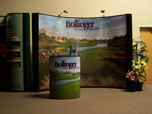
 Okay, so there are tabletops, back walls, islands, banner stands, floors, pop-ups, workstations and kiosks. WHOA!!
If you're having a hard time choosing, visit with an exhibit specialist (my favorite is Skyline Displays) and their sales team will help you determine what booth size is best for you.
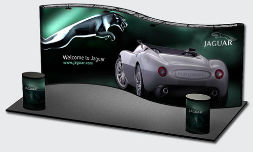
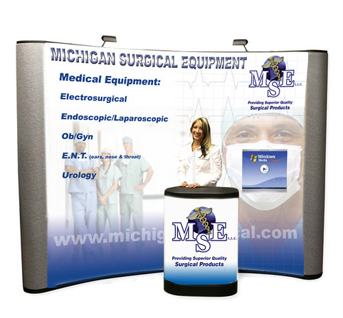
Standard booths are 10 x 10 and 20 x 20. There are many other combinations, but think in 10s. The exhibit on the right is 10 x 10.
Trade show & exhibit design links
- Skyline Displays - Design Tips
- Trade Show Exhibit Booth Design - Stand-Out Design
- Exhibit Trends in Your Industry


Great article, thanks so much! -do you have any suggestions on which tools/programs used for mocking up designs? say, Google Sketchup, AI or some other tool that would mock it up most accurately?
ReplyDeleteHi Lisa: Great question.
ReplyDeleteBest thing to do is ask your exhibit manufacturer what file formats they require.
Most designers used industry-standard software such as the Adobe series. I personally like to use Adobe InDesign for creating exhibit layouts.
Most manufacturers of these types of exhibits will require large-format graphics meaning, you design it to scale and at about 100 dpi.
They prefer original artwork files, but some do okay with high-resolution pdfs. It all depends on the people making it.
Hope this helps. Great question Lisa! Let me know if you've got any others. -kelada
Hi! I really like your blog. Couldn't help but notice that you used a photo of the BLUEMAN group Walk on banner stand that my company onpointvisuals built for them. It is a good example of an eye catching design with a clear message. We print trade show graphics every day and making a display "busy" or "cluttered" has got to be the most common mistake. Anyway I thought I would just let you know it's OK to use our pic.
ReplyDeleteThanks!
How do convince management that it is better to be economical in the amount of copy used on a display. I work for an engineering company and they tend to clutter the message?
ReplyDeleteHi,
DeleteBest way to do this is to remind them of the 7 Cs of communication. Completeness, Conciseness, Consideration, Clarity, Concreteness, Courtesy, Correctness. http://managementstudyguide.com/seven-cs-of-effective-communication.htm
If you can't say it in one sentence, you have no idea what it is you're trying to say!
DeleteThanks for updating us with the nice information.
ReplyDeleteFantastic displays...and very important these days, may be more than ever! Thanks for sharing.
ReplyDeleteTrade show displays can be very tricky - this is a good start. But from a marketing standpoint make sure that it says WHO you are and what you are marketing!!! Your exhibits is an extension of your company - remember that! Are you a custom exhibit? Portable exhibit? or a modular booth?
ReplyDeleteThis comment has been removed by a blog administrator.
ReplyDeleteThis comment has been removed by the author.
ReplyDeleteThis comment has been removed by a blog administrator.
ReplyDeleteThis comment has been removed by a blog administrator.
ReplyDeleteThis comment has been removed by a blog administrator.
ReplyDeleteThis comment has been removed by a blog administrator.
ReplyDeleteThis comment has been removed by a blog administrator.
ReplyDeleteThis comment has been removed by a blog administrator.
ReplyDeleteThis comment has been removed by a blog administrator.
ReplyDeleteUsing Trade Show Exhibits certainly boosts your marketing effort and you will certainly get a better result.
ReplyDeleteThe magic of design happens in your mind—so relax and don’t put pressure on yourself to put something down immediately on paper. People often think you need to be sitting at a computer to design, but you’re more likely to come up with inspired designs when running or lying in bed or doing whatever it is that frees up your thoughts.
ReplyDeleteamazing displays and nice post,to represent some others best information we need more...
ReplyDelete