

The tools of our time enables everyone to create high quality art work in the comfort of their own home. Moreover, if you are an ambitious artist, it may be a matter of time for you to come up with your own production quality project.
That's how good we have it, in terms of how far our instruments and our accessibility to them came in the recent years. While this creates a great opportunity for all, it also breeds an illusion underneath for some: That being the inconsequentiality of a strong traditional art background, in this digital age we live in...
My name is Jeff Treves; I'm an illustration, animation and design artist in both 2D and 3D fields. Even though I'm not strictly a "character designer" I create a good amount of characters for illustration and animation work. You may reach my on-line portfolio at www.jefftreves.com Thanks to my friend Dahlia Kelada for creating me an opportunity to write this article. If you'd ask me what were my favorite cartoon characters of all time, a few familiar names would pop up in my head immediately. I fell in love with so many different cartoons and characters since I was a kid, but for some reason the simplest ones were carved in my head as the most expressive.
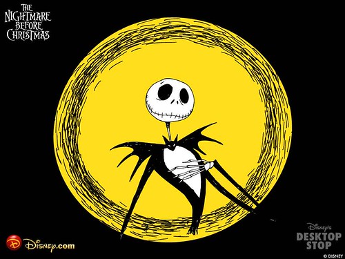
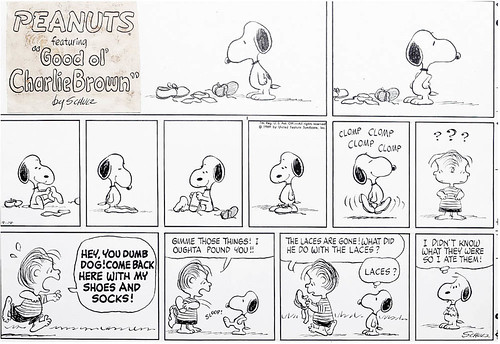
A few quick examples are Friz Freleng's The Pink Panther, Matt Groening's The Simpsons, Tim Burton's Skeleton Jack, Sam Keith's The Maxx, and Charles M. Schulz's Snoopy. To me, the shapes of those characters have the dominant features of a divine combination of geometrical forms, and that is exactly the kind of magic character art needs in order to be permanent in people's memories. As a start, I'll talk about the silhouettes.
The form you see is the most important feature of your character, that form will be moving and turning around on the screen/paper changing its pose, thus, its expression all the time. Look at your original character again with all its details and colors, and try to see the sub-shapes that makes the whole thing now.
 exaggerations brings out the expressive qualities of the character.
In that sense, you should always be daring to go out of the box with your exaggeration. And you should be thinking like a graphic designer when it comes to the overall silhouette of your character, and its relation to its sub-shapes.
Incredibly well done Oscar winner feature animation of recent years "The Triplets Of Belleville" can be a beautiful example of the exaggeration I'm describing here. Mickey Mouse, Pink Panther, Bart Simpson, Smurfs and etc., could easily demonstrate us the power of silhouettes.
Arguably one of the most beautiful films on the study of shapes, patterns and forms in animation is Richard Williams' broken dream - and probably one of the most important projects of his life - "The Thief and the Cobbler" I'd strongly suggest trying to find his original animatic to the ones who are curious on the subject, not the later-completed commercial version though...
We all know that it is hard to create art sometimes no matter how hard we try, or how talented/experienced we are. Point is, keep everything that is more than a scribble. Value you own work, no matter how simple or insignificant it seems to you.
You'll never know when you'll be needing it and how easy will be for you to develop it. Unless you are trying to create a reference drawing for a character to be modeled in 3D, avoid drawing it in a crucifixion-like straight pose.
 Creating a character requires a distinct personality, a universe that the character belongs to when thinking of its environment, and a mood that the character resonates when thinking of its colors.
If you are designing this character for an animation or a comic, it will be very useful to start thinking it as a three dimensional object. Because going forward, you'll have to figure out how it will look at different poses and angles.
Making refined turn-around drawings will nail down the character for anyone who'll be using it: Make your turn-around drawings on a single page right next to each other.
Draw parallel horizontal lines corresponding to distinct body parts of your first character drawing like the neck, the eyes, the shoulders, the belly, the knees, the feet and etc...

Use its limbs freely to perform what that character does...
If you are drawing a character for an illustration or painting, you are much more flexible I should say. Still art can capture only a moment, thus only one pose, one angle.
FUNDAMENTALS You need to think of the most expressive and emotive shapes in your piece. Positive and negative shapes that is. Where in comics, and animation especially, you'd have to consider the re-productibility of your character, in other words its efficiency and simplicity for future episodes.
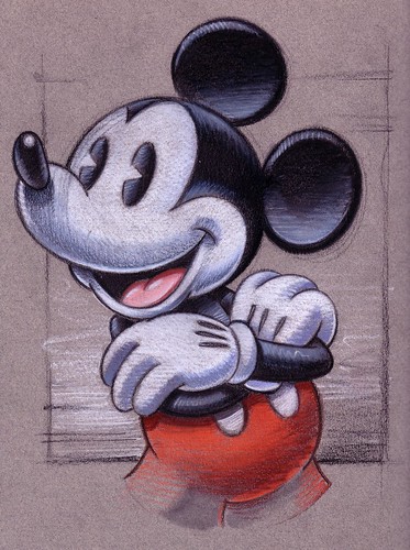
The importance of a clever combination of simple shapes (familiar geometrical forms) kick in right at this point: Because, if you break it down, all that Bart Simpson, Pink Panther, or Mickey Mouse is really made out of are a bunch of triangles, rectangles and spheres of different sizes...
Here I should mention that since the early years of animation it is conceived that round shapes versus rectangular shapes create less strobing on the screen, and drawing characters with less accessories (without unnecessary details) and less fingers are very efficient and economic ways to produce good quality work in this labor-intensive and tedious art form.
MAKE IT MEMORABLE Today I look around and see an abundance of cartoons, characters and stories. However, I'm personally having a hard time in finding distinctive and memorable artwork like I used to when I was a kid.
You may think that I'm a romantic stuck in the past, and you may be right! But I'm really having a hard time today finding something authentic inside the billions of zillions of reproductions of the same fairy, the same robot, the same zombie and the same warrior type.
How many different pictures of the same big-boob lady holding the gun can you picture in 1 second? I bet I was exposed to at least hundreds of them in the past few years. Though none of them was carved into my head like, lets say, the image of Snoopy.
Not to make a distinction here between the cartoony styles and realistic artwork. It's not about the genre, it's about capturing the magic. After all, who could forget Frank Frazetta's paintings, or H.R. Giger's Biomechanical aesthetic for that matter?
Note: http://www.animationarchive.org/ is a web site I've recently discovered. It is one of the greatest resources to the hart of the very art form we all have been in love with for decades: animation. Valuable articles within the site are the best road maps for all traditional/digital character artists, at least for the ones who are trying to become a little more than a digital craftsman constantly chasing the latest plug-in. Check it out, look around, it will definitely expand your vision.
Jeff Treves
http://jefftreves.com/
[Some pictures are from Google images]
"Thank you Jeff for your contribution to Subconscious Tonic." -kelada


No comments:
Post a Comment
What's on your mind creative genius? Abstrakt Designs wants to know.
WARNING: IF YOU TRY TO ADVERTISE YOUR BUSINESS ON THIS BLOG, YOUR POST WILL BE REJECTED AS SPAM.