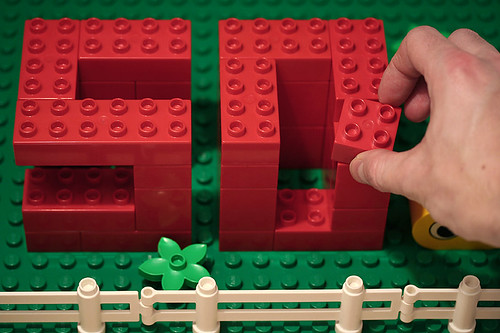
1. Awkward kerning and leading
2. Too much bold and italics in a passage
3. More than 2 typefaces
4. Using serif fonts for projected presentations
5. Putting two spaces after a period
6. Long lines of very small type
7. Narrow columns
8. Incorrect punctuation
9. Block justified text wrapping
10.Not lining up text across columns
What typography mistakes have you seen? Selectthe "comments" link below to post your response.
THIS BLOG IS BROUGHT TO YOU BY ABSTRAKT DESIGNS 713
Monday, June 25, 2007
Top 10 typography mistakes
Subscribe to:
Post Comments (Atom)


No comments:
Post a Comment
What's on your mind creative genius? Abstrakt Designs wants to know.
WARNING: IF YOU TRY TO ADVERTISE YOUR BUSINESS ON THIS BLOG, YOUR POST WILL BE REJECTED AS SPAM.